RESMAN
Introduction
Resman is a B2B food supplier that connects with sellers and buyers.
Resman Strives to accommodate customer delivery via systematic management.
Resman targets customers and workers who lack time or the ability to commute to work in a physical location.
The problem
Busy customers and workers lack the time necessary to commute to work in the physical location.
The goals
Develop B2B delivery system.
Increase user’s productivity.
Deliver management solution.
Scope
User Research
System Design
Design iOS App
Development
My Responsibilities
Conducting interviews, paper and digital wire-framing, low and high-fidelity prototyping, conducting usability studies, accounting for accessibility, and iterating on design.
Creative Process
During the design process, the mission is to strive to accommodate the needs of the customers. While targeting to deliver the functionality, also make sure to design a product that is universal for users.
Research
I conducted interviews and created empathy maps to understand the users I’m designing for the needs. A primary user group identified through research was working adults who didn’t have time to efficiently manage the kitchen inventory.
This user group confirmed initial assumptions about Resman customers, but the researcher also revealed that time was not the only factor limiting users from working efficiently. Other user problems included obligations, interests, or challenges that make it difficult to get ingredients right on time in a restaurant in- person.
Method
Focus Group
Survey
In-depth Interviews
Competitor Analysis
Techniques
Journey Map
Empathy Map
Personas
Scenarios
User research:
pain points
1
Time
Chefs are too busy to spend time writing on excel sheets.
2
Accessibility
Platforms for supplies are not equipped with assistive technologies.
3
In App
Icons without subheadings are often difficult to comprehend to interact.
Principles
This user group initial assumptions about RESMAN customers, but research also revealed that time was not the only factor limiting users working efficiently. Other user problems included obligations, interests, or challenges that make it difficult to get ingredients right on time or being in restaurants in-person.
Visual design must follow the brand’s guidelines which are sleek, homie, and sympathy.
Emphasis on how people perceived the product emotionally.
The app has to be easily expandable to additional features in the future.
Wireframe
Brainstorming and refreshing the design to draft iterations of the element that would be well-suited to address user’s pain points.
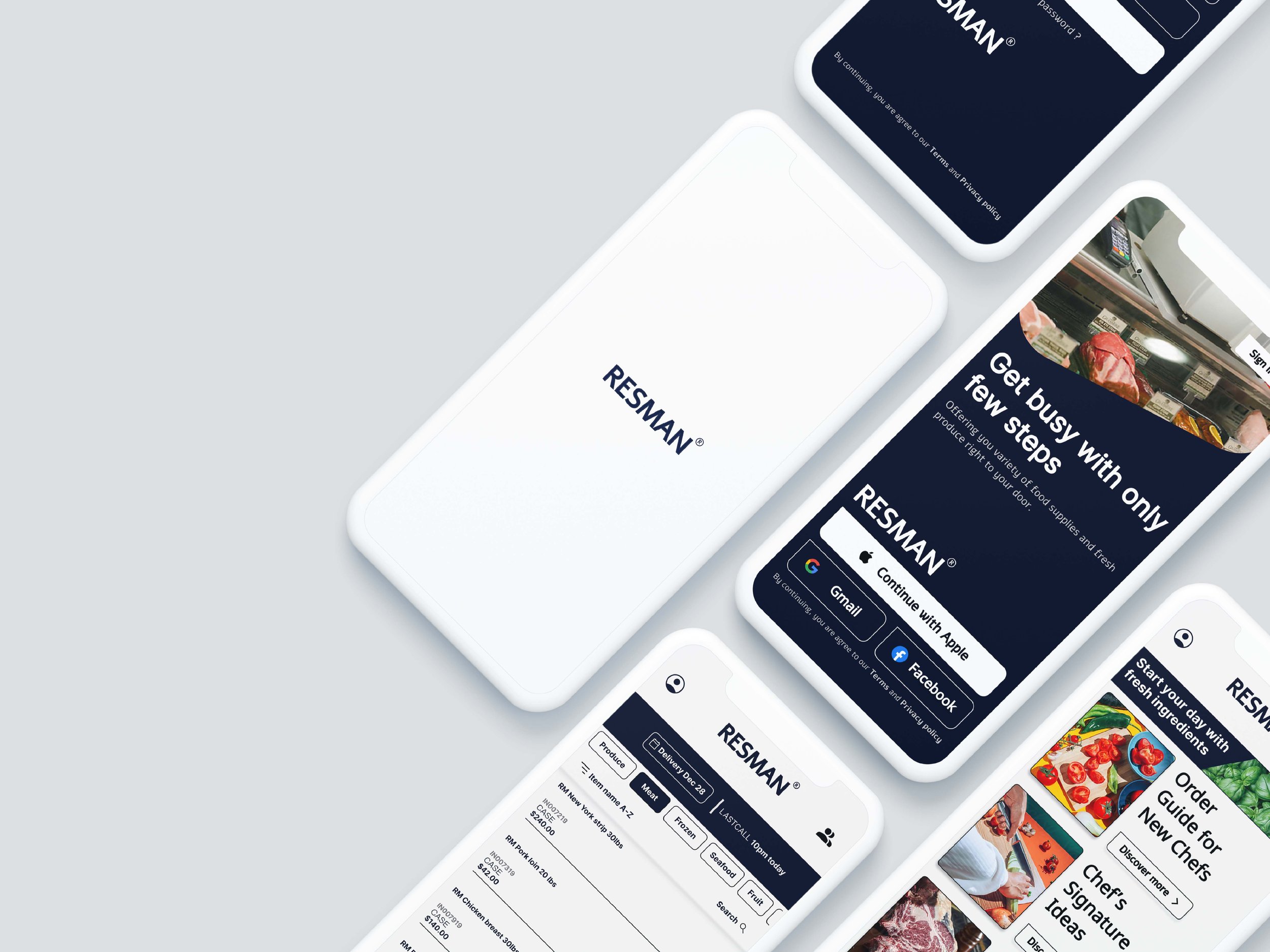
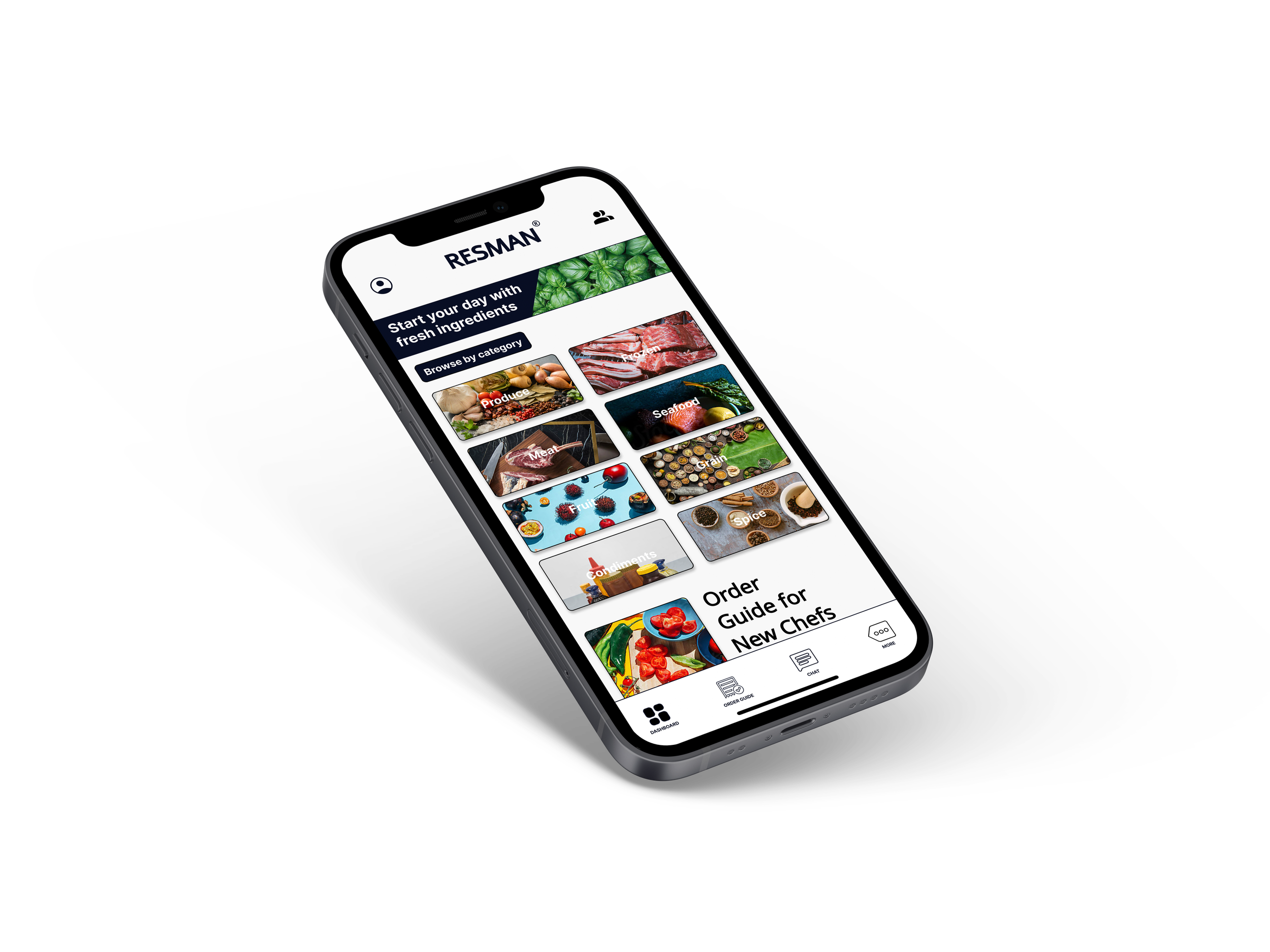
For home screen, I prioritized images for a quick and easy order browsing process to help users save time and avoid confusion.
The low-fidelity prototype connected the primary user flow building and completing orders, so the prototype could be used in a usability study users
Based on Usability Studies
Easy access one screen dashboard navigation
Horizontal scroll in order guide screen make it easy for users to follow up
Understanding Information Architecture
Easy to navigate was a key user’s need to address in the design in addition to equipping the app to work with assistive technologies. As the initial design phase continued, I made sure to base the screen design on feedback and findings from user research.
This is one of my user’s stories
Usability Studies
I conducted two rounds of usability studies. Findings from the first study guide the design from wireframes to mockups. The second study used a high-fidelity prototype revealing what aspects of the mockups needed refining.
Improve the Design Functionality
/01
Early designs allowed users to browse categories of ingredients at the time by horizontal scrolling. The revised version allowed users to browse supplies on one screen as well as comprehensively to navigate user flow for B2B with the supplier directly.
/02
Revised by switching the announcement image to delivery date and last call as a user reminder.
Accesibility Consideration
/01
Provide icons to help users navigate more easily.
/02
Provide detailed imagery for the type of ingredient to assist users in better understanding the product.
/03
Include horizontal scroll all to avoid user’s confusion while browsing shopping cart.
Impact
Takeaways
What I learned
The app’s accommodative features solved the user’s needs and accommodate.
While designing the Resman app, I learned that emphasizing the user’s needs helps me narrow down my design thought pattern effectively. usability studies and peer feedback influenced each iteration of the app’s designs.
Next Step
/01
Conduct more user research to determine any area of need.
/02


